Awakening 0.5 Maps and Level Design
I've been feeling a game developer who has been lucky enough to have wonderful people help create some awesome assets for this project. Lately there has been an appreciation of all the work it takes to make a game look and feel great, there is still so much to learn but I feel that the direction this project is headed is the right one.
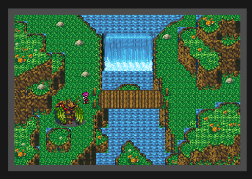
In the beginning there was the idea of a green level in the mountains. A quick mock up to get an idea of how the color would work out.

After a few hours of polish to the tiles improved the feeling quite a bit! It looked great but the lack of movement made it feel stiff.

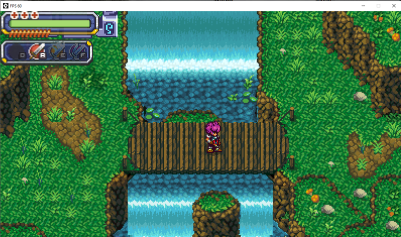
A few objects to help the colors and liven the place up a bit. These felt super stiff and first in many other games the player isn't able to pass by objects these served as a type of invisible wall and in some games it worked out but it just didn't feel that great.

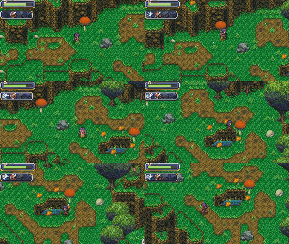
Updating the objects to interact with the player in a non combative way the area is much livelier!

This level marks the 55% completion mark for the project and a great milestone for this two year journey.
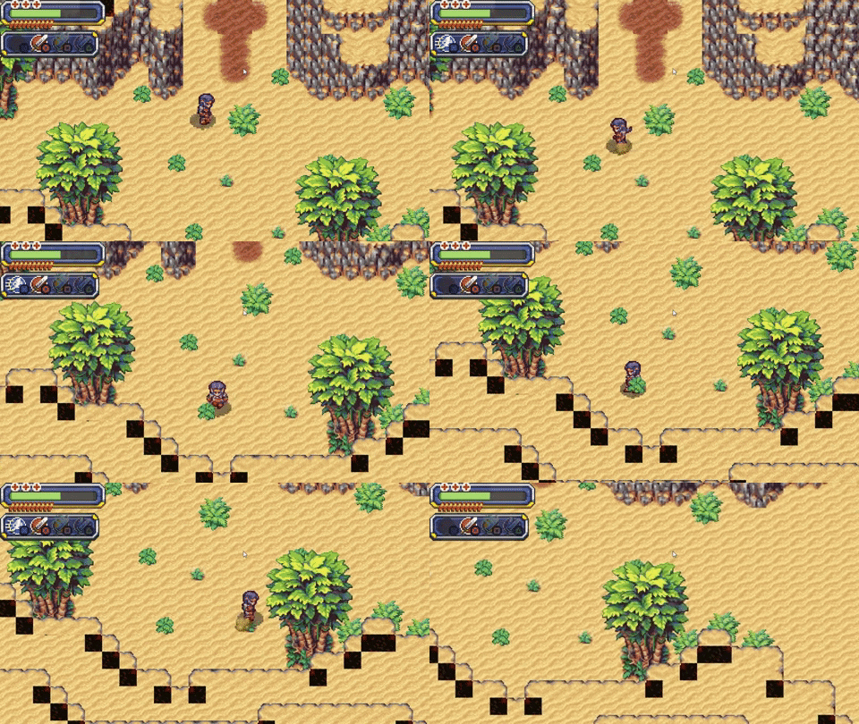
A sneak peak at the next level which will have randomly generated elements :D

Get Awakening
Awakening
Awaken your memories by restoring a magical sword.
| Status | In development |
| Author | actionheroiv |
| Genre | Action |
| Tags | Action RPG, GameMaker, Indie, Pixel Art, Retro, Top-Down |
| Languages | English |
More posts
- Awakening 0.7.10 - Incoming Boss Fight!Jun 20, 2020
- Awakening 05.1 - Random Level GenerationOct 14, 2019
- Awakening 04.5 - UI Update!Apr 16, 2019
- Awakening 04.2 - New enemy, shops, and inventory.Feb 19, 2019
Leave a comment
Log in with itch.io to leave a comment.