Awakening 04.5 - UI Update!
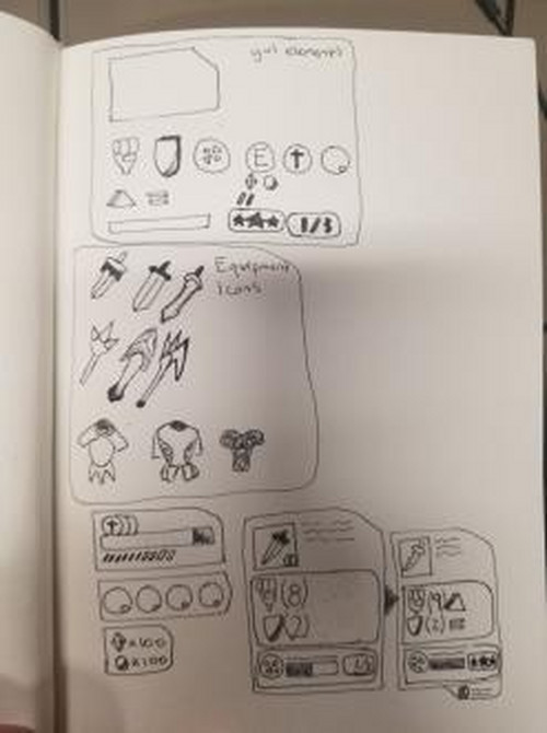
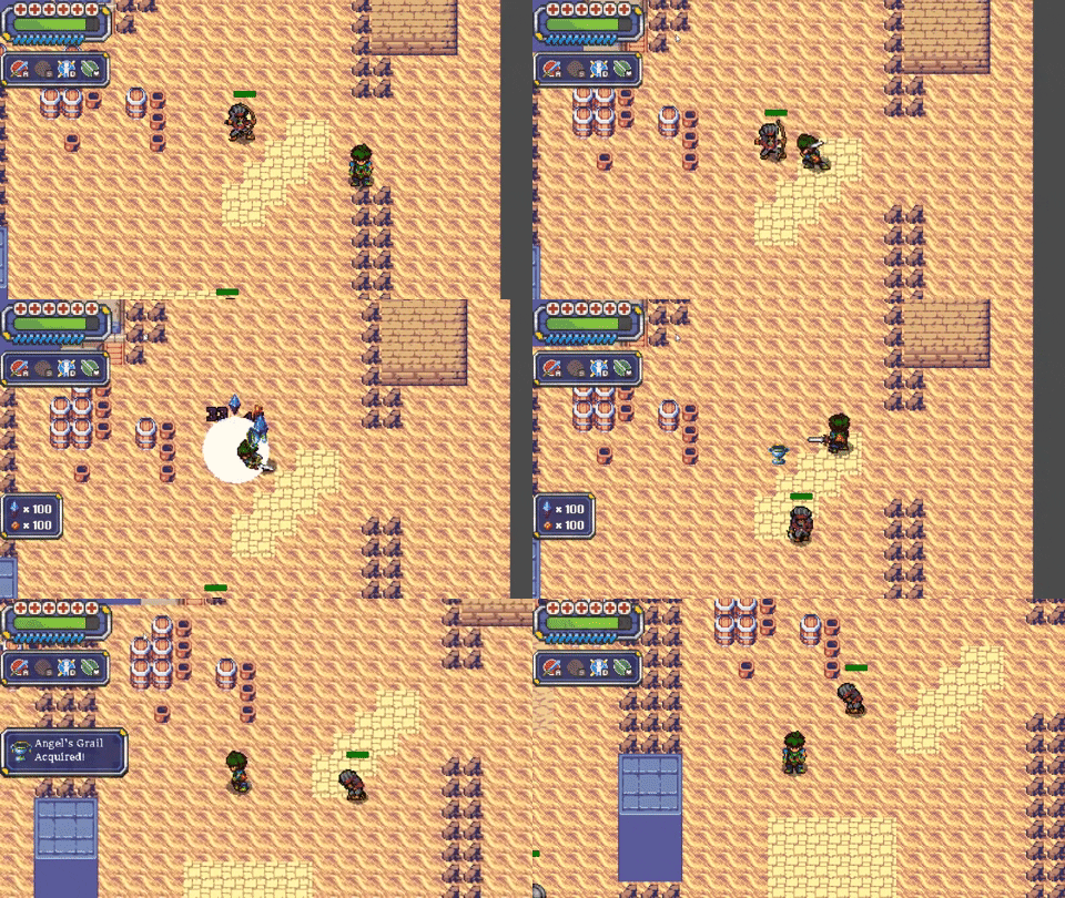
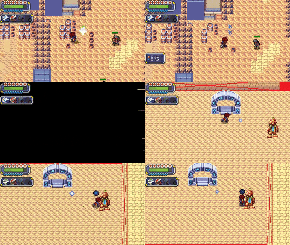
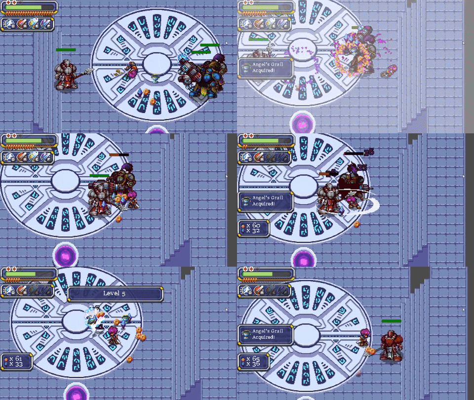
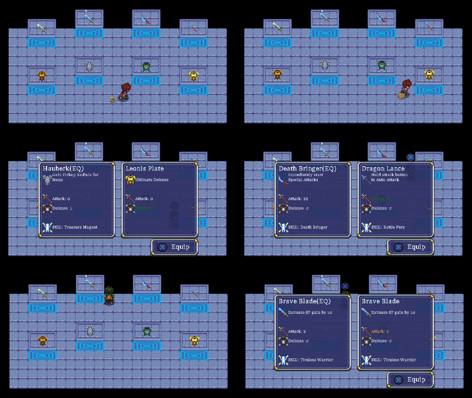
The goal of this patch was to update the UI to provide the player with enough information to make their own decisions, for example deciding which weapon to choose, or what armor they wanted based on the effects they had. The next goal wanted remove the last remaining bits of sprites that were not actually owned.
After doing some usability and functionality tests with quick sketches on 10 users, we came up current design. We found that it was really bulky in game, so we did some work to resize the UI first to figure out what looked best. We decided on about 8% of the screen real estate would be sufficient and instead of having something solid, adding a bit of transparency helped the look significantly.
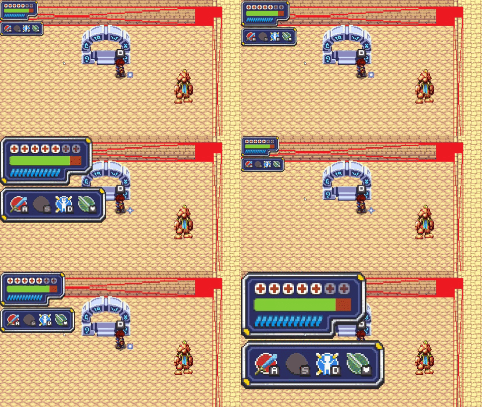
After that was the step of creating a medium fidelity prototype from the hand drawn sketches.
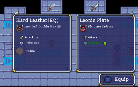
Things looked a bit messy on the first run. After an hour of cleanup, the equip menu is starting to look much better. It could still use maybe another border around the icons to group certain sections with a heading(ie Stats - att, def. Abilities - double sp), perhaps and adjustment to the icons and some animations.
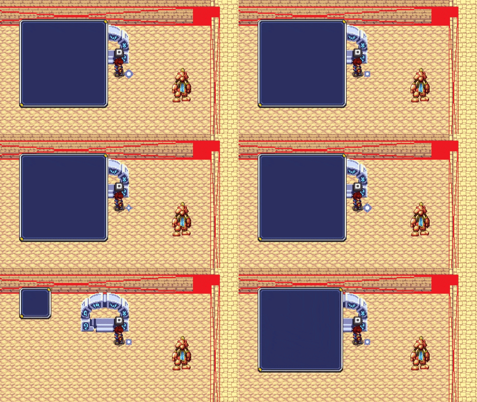
Then slow stripping out the other parts of old code and putting in the new UI elements.
Files
Get Awakening
Awakening
Awaken your memories by restoring a magical sword.
| Status | In development |
| Author | actionheroiv |
| Genre | Action |
| Tags | Action RPG, GameMaker, Indie, Pixel Art, Retro, Top-Down |
| Languages | English |
More posts
- Awakening 0.7.10 - Incoming Boss Fight!Jun 20, 2020
- Awakening 05.1 - Random Level GenerationOct 14, 2019
- Awakening 0.5 Maps and Level DesignJul 10, 2019
- Awakening 04.2 - New enemy, shops, and inventory.Feb 19, 2019
Leave a comment
Log in with itch.io to leave a comment.